
Our only agenda is to publish the truth so you can be an informed participant in democracy.
We need your help.


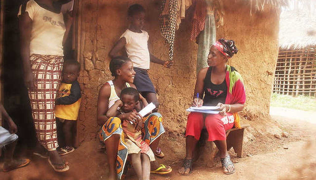
A health care workers interviews residents in Billibo, Liberia, a country that lacks key data on poverty. (Direct Relif, via Flickr Creative Commons)
The success story of aid groups in developing countries often includes a line about lifting people out of poverty. But what if the data behind such claims was suspect?
That’s the contention of economist Morten Jerven at the Norwegian University of Life Sciences. Jerven, a noted skeptic of African development statistics, says it’s a case of the "PR department getting ahead of the knowledge department."
For 21 countries in Sub-Saharan Africa, for example, "we simply do not have data to say anything about trends in poverty," Jerven wrote recently.
As fact-checkers, we at PolitiFact can be asked to rely on the data Jerven is calling into question. So we decided to put his claim to the test.
It takes two data points to tango
Jerven based his claim on a simple law about measuring things: If you want to spot a trend, you need to have a starting point and an end point. Importantly, you need to measure the same thing at both times. To give a crude example, if one year you ask people how much they earn and 10 years later ask them how much their entire household makes, you can see how it would be difficult to make comparisons and draw conclusions.
The World Bank identified problems with the data points for countries in Sub-Saharan Africa.
"By 2012, only 27 of the region’s 48 countries had conducted at least two comparable surveys since 1990 to track poverty," a 2016 report said.
Do the math, and you get Jerven’s 21 countries without a starting and an end point on poverty.
Andrew Dabalen, lead economist in the World Bank’s Poverty and Equity Global Practice, doesn’t quibble with Jerven’s statement, at least not too much.
He and his colleagues vet the data that comes out of Africa. In some countries, such as Liberia and Sudan, there’s just one survey. Somalia has none. Kenya has four, but each was too different from the others to make any firm conclusions.
Where do surveys run into issues? They might not match because they drew from different areas -- say a national sample versus urban residents. Some had people fill out daily diaries, while others asked people after the fact to remember what they bought or produced for themselves. Simply taking a survey at different times of the year, harvest versus planting season, could radically change the results.
"Based on the review using these criteria, we find that indeed 21 countries did not have at least two comparable surveys to say something about trends," Dabalen told us.
Keeping things consistent is not a trivial issue, or a new one. In the mid 1990s, India shifted from asking people what they consumed in the past month to what they consumed in variety of time periods -- from as short as one week to as long as a year. Virtually overnight, the official number of people in poverty fell by about 200 million, a result that many analysts challenged.
Even in the United States, scientists often fret anytime the U.S. Census Bureau debates or discusses changing the questions it asks, for fear that it will jeopardize useful data.
Filling in the gaps
Confronted with missing data, Dabalen and his colleagues have a few workarounds that can help in some places. Numbers for an entire nation’s economy, its gross domestic product, are generally available. Dabalen said you can use GDP trends to estimate household consumption, and from that, derive a poverty level.
"Such a method has its issues, but it is used widely and under certain assumptions, it predicts reasonably well," Dabalen said.
But it’s not perfect.
Branko Milanovic, senior scholar and specialist in global inequality at the CUNY Graduate Center, said the most you can learn from GDP is how things changed on average. If most of the economic growth flowed to the wealthy, the poor might gain little. (The income gains of the top 1 percent to 5 percent in the United States in recent years is a good example.)
"A change in the mean does not tell us anything about the change in the distribution," Milanovic said.
Dabalen told us about other techniques that derive missing numbers from a range of surveys that can tie economic well-being to other measures such as spending on food, housing conditions or education levels.
On a large scale, looking at an entire region, this statistical alchemy can at least show the direction of change. This World Bank chart tracks results for 48 Sub-Saharan nations. The blue line is based only on countries with solid, comparable data. The other lines rely on something less than that.
So policy makers can have a sense of the trends in poverty, even if they can’t say for sure what the poverty level is.
But again, that’s from a regional vantage point. For any single country with very limited data, these techniques get dicey. According to the World Bank, the use of alternative surveys to fill in missing information sometimes showed poverty going down, when based on more reliable numbers, it was actually going up.
Steps are under way to deal with the larger data problem, but a lot of work remains.
Oddly, the lack of hard data doesn’t necessarily mean that poverty is worse than we think. Dabalen and his colleagues wrote that a number of crosschecks of all the information "support the notion that poverty reduction may have been larger than assumed."
Our ruling
Jerven said that for 21 countries in Sub-Saharan Africa, "we simply do not have data to say anything about trends in poverty."
His number comes directly from a careful vetting of poverty surveys by the World Bank. That analysis described in detail the holes in the information needed to track poverty.
Jerven pushed his point a bit too far by saying that we can’t say anything about trends. Alternative methods give a reasonably reliable picture of overall trends, even if they can’t tell policy makers what the actual poverty rate might be.
But at the end of the day, the consensus among the experts we reached is that the gap Jerven talked about is real and rather than use workaround techniques, everyone would prefer solid data.
We rate this claim Mostly True.
https://www.sharethefacts.co/share/26108662-dcbd-407b-aabe-b10379895175
Morten Jerven, Development by the numbers, 2016
World Bank, Data Deprivation: Another Deprivation to End, April 2015
World Bank, Poverty in a rising Africa, 2016
World Bank, A measured approach to ending poverty and boosting shared prosperity, 2015
Bill Gates, If We Can Get the Numbers Right, We Can Help More People, May 2, 2013
World Bank, Data and dogma: The great Indian poverty debate, 2005
Email interview, Andrew Dabalen, lead economist in the World Bank’s Poverty and Equity Global Practice, June 29, 2016
Email interview, Branko Milanovic, senior scholar, CUNY Graduate Center, June 30, 2016
Email interview, Morten Jerven, associate professor, Norwegian University of Life Sciences, June 29, 2016
Photo: Billibo, Liberia, Direct Relief, Creative Commons License
In a world of wild talk and fake news, help us stand up for the facts.
