Get PolitiFact in your inbox.
Election results map spreading on social media is from 2016, not 2020
If Your Time is short
- This map shows county-by-county election results in 2016.
A U.S. map that shows election results in red and blue is being shared on social media as some users cast doubt on Joe Biden’s victory.
We have found no evidence that Biden did not fairly win the presidential election, and the map that’s circulating online is actually from 2016—not 2020.
"Pretty RED to me," wrote one person who shared the map.
"I'd say it’s pretty much all red, but maybe I’m seeing things?" someone else said.
These posts were flagged as part of Facebook’s efforts to combat false news and misinformation on its News Feed. (Read more about our partnership with Facebook.)
We did a reverse image search using the map and found it has been used widely online since 2016. It’s on Wikimedia Commons, where it’s described as a "2016 nationwide US presidential county map shaded by vote share."
It was used to illustrate an event listing for a February 2020 student debate on whether the United States should abolish the electoral college.
It ran with a 2018 Religion News Service opinion piece about Christians and political divides.
And it was used on the cover of a 2019 issue of Washington Monthly, accompanying a story titled, "To take back the map, Democrats need a plan to revive heartland cities."
The map looks different this election, as CNN and the Washington Post, among other news organizations, have reported. The Post has a graphic that helps illustrate the change, showing red and blue blowing particles across the United States. Red flowing right indicates greater support for Trump than in 2016, while blue flowing left shows more voters leaning Democrat.
"Compared to this year, the 2016 map portrays a blizzard blowing right for Trump across the country," the Post explained. Even areas that voted for Hillary Clinton gave her much less support than Barack Obama had received.
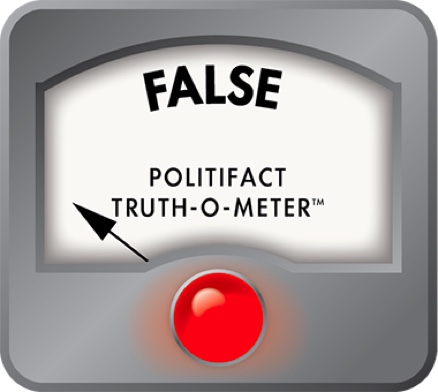
We rate claims that this map shows 2020 election results False.
This fact check is available at IFCN’s 2020 US Elections #Chatbot on WhatsApp. Click here, for more.
Our Sources
Facebook post, Nov. 8, 2020
Facebook post, Nov. 11, 2020
Wikimedia Commons, 2016 nationwide US presidential county map shaded by vote share, visited Nov. 11, 2020
University of Pennsylvania, PPU Debate - should we abolish the electoral college? Feb. 27, 2020
Religion News Service, How Howard Thurman can help Christians heal their political divides, Oct. 16, 2018
Washington Monthly, January/February/March 2019 issue
Washington Monthly, Past issues, visited Nov. 11, 2020
CNN, Biden’s win was more decisive than you think, Nov. 7, 2020
The Washington Post, 2016 vs. 2020 election map, Nov. 7, 2020
Browse the Truth-O-Meter
More by Ciara O'Rourke
Election results map spreading on social media is from 2016, not 2020
Support independent fact-checking.
Become a member!
In a world of wild talk and fake news, help us stand up for the facts.


