Stand up for the facts!
Our only agenda is to publish the truth so you can be an informed participant in democracy.
We need your help.
I would like to contribute
Rocker in viral video mocks U.S. for 37th-best health care in world
With biting sarcasm, singer Paul Hipp says the United States should be proud of its global ranking on health care.
"We're No. 37!" he sings in a YouTube video released Sept. 9, 2009.
With some electric guitar riffs and topical references to the summer's vitriolic debate over health care reform — including Rep. Joe Wilson's "You lie!" heckle of President Barack Obama — the satiric romp "celebrates" the United States' standing:
We're No. 37
We're the U.S.A.
We're No. 37
And we're so proud to say
We got old people crying at the pharmacy
Pay your deductible
This ain't the land of the f-f-f-free Grandma
We're No. 37
We're the U.S.A.
The number refers to the World Health Organization's ranking of the United States as the 37th best health care system in the world, out of 191 countries. In a cheeky countdown, the video shows viewers a cross-section of nations that ranked better than the United States in WHO's tally — a mix of industrialized nations in Western Europe, Scandinavia and Asia; wealthy oil producers from the Middle East; tiny realms of prosperity such as Monaco and Luxembourg; and some seemingly unlikely nations such as Colombia, Cyprus, Morocco, Dominica and Costa Rica.
It's an anthem for health care reform that even shows its sources: Hipp includes a shot of himself looking at WHO's report. So he wins points for transparency in sourcing.
But as hummable as the song is, we thought it deserved a bit of scrutiny. How did WHO arrive at the numbers? And how widely accepted is the health organization's methodology? Ultimately, did Hipp choose a good benchmark on which to base his song?
Observers generally agree on two things about the report. It was a landmark study that attracted a lot of attention around the world. And its conclusions have inspired controversy for nearly a decade.
We should point out that the ranking is actually not new. WHO, an arm of the United Nations, published the international comparison in its
World Health Report 2000
, and it hasn't been updated since. (Other groups have offered their take, as we explain below.)
Five factors went into WHO's calculation:
• Health level, as defined by a measure of life expectancy, which shows how healthy a country's population is. This factor gets a 25 percent weight.
• Responsiveness, which includes factors such as speed of health services, privacy protections, choice of doctors and quality of amenities. This factor gets a 12.5 percent weight.
• Financial fairness, which measures how progressive or regressive the financing of a country's health care system is — that is, whether or not the financial burdens are borne by those who are economically better off. This factor receives a 25 percent weight.
• Health distribution, which measures how equally a nation's health care resources are allocated among the population. This factor receives a 25 percent weight.
• Responsiveness distribution, which measures how equally a nation's health care responsiveness (which we defined above) is spread through society. This factor gets a 12.5 percent weight.
Once these statistics were collected, the WHO combined them into two summary rankings. One, called "overall attainment," is the basic weighted average of the five factors listed above. The other, called "overall performance," took that number and adjusted it for how well a country's health system was doing compared to how well WHO's experts believed it
should
be doing based on education level and economic resources.
Using the second of the two ratings — overall performance — the United States does indeed rank 37th. But using the first factor — overall attainment — the United States does better, finishing 15th. One might be tempted to downgrade Hipp's song for cherry-picking the less favorable number, but Hipp seems to be on solid ground here. The WHO itself considers overall performance to be the more important ranking of the two. In a news release accompanying the original report, the WHO placed the 37th-place ranking right near the top and never even mentioned the 15th-place ranking. So it seems fair to us for Hipp to focus on that number.
Of course, any ranking — whether it's
U.S. News and World Report
's ranking of universities or the WHO's ranking of health systems — is subject to disputes over what factors should be included. In his 2009 book,
The Healing of America: A Global Quest for Better, Cheaper and Fairer Health Care
, journalist T.R. Reid finds value in the WHO's study even as he acknowledges that it is "all but impossible to design a single rating scale that would accommodate countries ranging from Monaco (population, 33,000; per capita income, $30,000 per year) to Nigeria (population 101 million; per capita income, $310 per year)."
Despite some quibbling on technical matters, most observers broadly agree that two of the WHO's five measures — health level and responsiveness — are reasonable. The first statistic gauges health outcomes, which are obviously a health care system's No. 1 goal, and the second seeks to measure how well a health system works when interacting with patients, another widely agreed upon mission.
But there is far less consensus over the other three factors. Concerns stem from a mix of methodology and ideology.
Glen Whitman, an associate professor of economics at California State University at Northridge, offers one critique in a paper for the libertarian Cato Institute. "Suppose, for instance, that Country A has health responsiveness that is 'excellent' for most citizens but merely 'good' for some disadvantaged groups, while Country B has responsiveness that is uniformly 'poor' for everyone," he writes. "Country B would score
higher
than Country A in terms of responsiveness distribution, despite country A having better responsiveness than Country B for even its worst-off citizens."
Whitman also joins other conservatives in taking issue with the assumption that the rich should pay a similar percentage of their income for health care as the poor do. Because basic mathematics suggests that those with smaller incomes will naturally spend a larger share on highly important items such as food and health care, doing well in WHO's rankings almost requires a steeply progressive tax structure.
WHO officials make no bones about their desire to push countries in the direction of aiding the have-nots. They gave the controversial factors that reward socioeconomic fairness 62.5 percent weight, compared with only 37.5 percent for the broadly accepted factors of health level and responsiveness.
Tweak the weighting a little bit and a country such as the United States rises or falls in the rankings. For instance, judged on responsiveness alone, the United States ranked No. 1 in the world. A bigger weight for that factor — and a smaller weight for financial fairness, where the United States ranked 54th in the world — would have given the country a much higher ranking.
Adding other factors could also change the results. A 2001 paper in the journal Science found that adding just one more variable into the mix changed the rankings dramatically for 79 of 96 countries studied.
Featured Fact-check
Meanwhile, Whitman also raised questions about the WHO's "overall performance" measure — the one in which a country's health ranking is adjusted for its education level and economic resources. (This is the category in which the United States finished 37th.) The implication from the WHO itself as well as subsequent news reports, Whitman wrote, "is that the United States performs badly ...
despite
its high expenditures." In fact, he writes, in the WHO's statistical model, America's first-in-the-world expenditures for health care actually hurt its ranking in overall performance by setting the theoretical bar it had to reach very high. "A more accurate statement is that the United States performs badly
because
of its high expenditures, at least in part," Whitman writes.
Finally, a number of other critics say that WHO listened to the experts but did not measure public satisfaction with health care.
A paper published in the journal
Health Affairs
found the rankings did not necessarily reflect whether people were happy with their country's health coverage. For instance, Italy finished second in WHO's study, even though only 20 percent of its citizens say they were satisfied with their health care system. Meanwhile, Denmark ranked 16th in the WHO report even though 91 percent of Danes say they were satisfied.
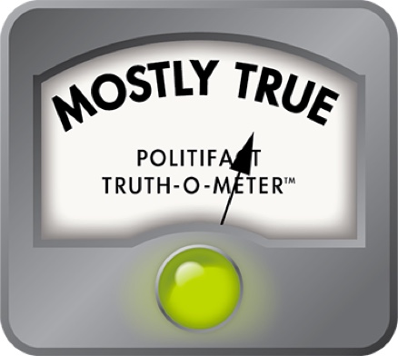
So while Hipp is right that the United States ranked 37th in the most widely known barometer in the WHO study, it ranked 15th by another WHO ranking and, for one factor (responsiveness) it actually ranked No. 1. Still, this is a rock song, and a well-sourced one at that. So we find Hipp's claim to be Mostly True.
Sign up for PolitiFact texts
Our Sources
Paul Hipp, "We're No. 37" YouTube
video
, posted Sept. 9, 2009
World Health Organization,
World Health Report 2000: Health Systems, Improving Performance
, published June 2000
World Health Organization, "World Health Organization assesses the world's health systems"
news release
, June 21, 2000
Glen Whitman, "WHO's Fooling Who? The World Health Organization's Problematic Ranking of Health Care Systems," Cato Institute
paper
, Feb. 28, 2008
Robert J. Blendon, Minah Kim and John M. Benson, "
The Public vs. the World Health Organization on Health System Performance
," Health Affairs, May-June 2001
T.R. Reid, The Healing of America: A Global Quest for Better, Cheaper and Fairer Health Care,
published 2009
Dean T. Jamison and Martin E. Sandbu, "
WHO Ranking of Health System Performance
," Science magazine, Aug. 31, 2001
Browse the Truth-O-Meter
More by Louis Jacobson
Rocker in viral video mocks U.S. for 37th-best health care in world
Support independent fact-checking.
Become a member!
In a world of wild talk and fake news, help us stand up for the facts.


