
Our only agenda is to publish the truth so you can be an informed participant in democracy.
We need your help.


Democratic presidential candidate Pete Buttigieg addresses the National Action Network convention in New York City on April 4, 2019. (AP)
During an interview on Vox.com co-founder Ezra Klein’s podcast, Democratic presidential candidate Pete Buttigieg highlighted growing inequality in the United States.
In response to a question from Klein about the the conservative era ushered in by President Ronald Reagan, Buttigieg said the governmental approach at the time "had a lot to do with the removal of regulation, the weakening of labor standards, and slashing taxes at every level, based on this presumption that this would grow the economy. And on one level it did. The top-line growth numbers were pretty great. On the other hand, if my numbers are right, since 1973, the income of the bottom 90 percent, so pretty much all of us, didn’t budge, or even retreated a little bit."
Is he right that for most people, income levels -- adjusted for inflation, which economists consider a necessity for such comparisons -- haven’t increased since 1973? The data shows that income levels have actually risen beyond inflation during that period, but the share of income taken by the bottom 90 percent hews pretty closely to what Buttigieg said. (Buttigieg’s campaign did not respond to inquiries.)
Neither we nor economists we consulted with could find an exact data set that fit Buttigieg’s wording, but we found one that was close. It was calculated by the Congressional Budget Office, the nonpartisan number-crunching arm of Congress, and covered 1979 to 2015, most of the period in question.
The figures CBO used are adjusted for inflation and federal taxes, but not for for state and local taxes. They show income growth for people in four different economic ranges: the lowest 20 percent of the income distribution, the middle 60 percent, the 81st percentile to the 99th percentile, and the top 1 percent. These don’t mirror Buttigieg’s precise parameters, but economists told us they are useful for showing whether he’s broadly right or not.
Here’s a chart summarizing what Buttigieg found:
The top 1 percent, in red, have the most unique and most impressive growth.
The other income groups are tightly clustered together. But look closely at the slope of the line: It heads upward. The rise is nowhere near as fast as it was for the top 1 percent, but it did increase after being adjusted for inflation.
This undercuts Buttigieg’s assertion that for most people, income "didn’t budge, or even retreated a little bit," since the 1970s. And Gary Burtless, an economist with the Brookings Institution, added that the subsequent data since 2015 would likely show additional increases, since incomes across all the income distribution have improved since 2015. (He also said that adding in data for 1973 through 1978 would be unlikely to make a difference.)
Buttigieg’s statement "is very unlikely to be true," Burtless said.
That said, other data supports Buttigieg’s claim more closely. Let’s look at wages, which are what you earn from your job; it does not include other types of income, including interest and payments from programs like Social Security or food stamps.
The following chart, drawn from data collected by the left-of-center Economic Policy Institute, shows inflation-adjusted data for wages going back to 1973. We’ve broken down the wage levels by 10 percent increments -- the lowest 10 percent, the next 10 percent, and so on.
The chart shows clear wage stagnation for the bottom 60 percent of the income scale. The rate did go up for the 70 and 80 percent levels, which means that Buttigieg’s 90 percent figure would be a bit exaggerated. (It’s also worth noting that wage data excludes income from Social Security, Medicare, Medicaid, food stamps, and refundable tax credits like the earned income tax credit, so it’s an incomplete picture of household income.)
And what if you look at the percentage of total income taken by each group, rather than just "the income"? This is a meaningful way of looking at the trend because, if income is generally rising, it’s possible for people to see an increase in income even as their percentage of the pie stays the same or goes down.
This metric closely follows the pattern Buttigieg cited.
The World Inequality Database builds off the work of economists Thomas Piketty and Emmanuel Saez, who have specialized in income inequality. Their approach does not receive universal approval -- they use pre-tax income and include realized capital gains, which likely magnify the income for the wealthiest -- but economists say their approach is not unreasonable.
Here’s a chart showing the share of income taken by four different parts of the income distribution:
This shows that both the bottom 50 percent and the next 40 percent -- essentially the 90 percent that Buttigieg cited -- have taken declining shares of the nation’s income since 1973. By contrast, both the top 10 percent and the top 1 percent have seen their shares grow.
The parallels between Buttigieg’s statement and the World Inequality Database figures are strong, said Brendan Duke, a tax policy analyst at the liberal Center on Budget and Policy Priorities.
"Many analysts would argue that the CBO data are a more complete concept of ‘income’ as frequently defined in economics, but one could also argue that the Saez-Piketty data more closely approximate how most Americans think of income," Duke said. "If you asked most Americans what their income is, they probably wouldn’t count the premiums their employer pays toward their health insurance or the value of Medicare services they receive, something the CBO data do include."
Buttigieg said, "Since 1973, the income of the bottom 90 percent, so pretty much all of us, didn’t budge, or even retreated a little bit."
Actually, income for every group, as calculated by the CBO, has increased beyond the rate of inflation since the 1970s. However, another measurement -- the share of income taken by the bottom 90 percent -- has indeed declined since 1973.
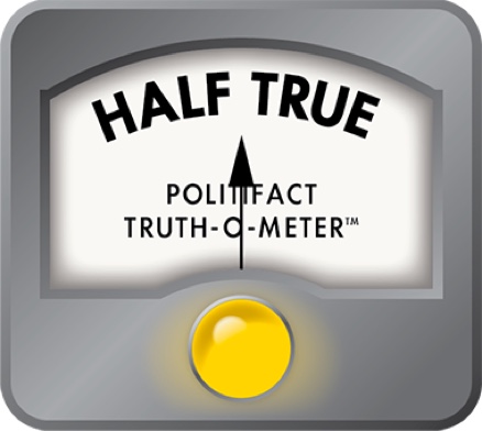
We rate the statement Half True.
Pete Buttigieg, interview on Ezra Klein’s podcast, April 1, 2019
Congressional Budget Office, "The Distribution of Household Income, 2015," November 2018
Economic Policy Institute, wages by percentile, accessed April 4, 2019
World Inequality Database, accessed April 4, 2019
Center on Budget and Policy Priorities, "Guide to Statistics on Historical Trends in Income Inequality," Dec 11, 2018
Email interview with Gary Burtless, senior fellow at the Brookings Institution, April 4, 2019
Email interview with Brendan Duke, tax policy analyst at the Center on Budget and Policy Priorities, April 4, 2019
In a world of wild talk and fake news, help us stand up for the facts.
